Share this
As the future of South Carolina’s healthcare is hotly debated, it’s important to keep a close eye on the data being presented. A pair of maps, presented as the number of people expected to participate with the Affordable Care Act in comparison to where the population need is, would suggest that the two sets of numbers don’t add up to make sense for South Carolina. The problem is that the maps don’t use the same set of data to make the case. In response, the Ruoff Group has a pair of maps of its own that display a more accurate picture of where SC could be headed if it accepts Medicaid expansion.
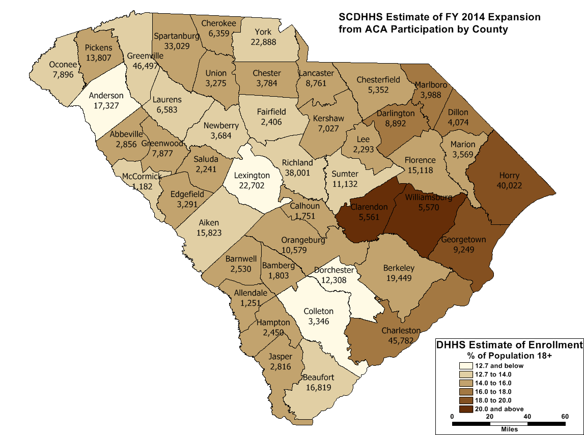
Figure 1
The map above shows the SC Department of Health and Human Services’ estimate of FY2014 enrollment assuming a Medicaid expansion and including currently eligible folks who enroll, as a percent of the population 18 and above from the 2010 Census.
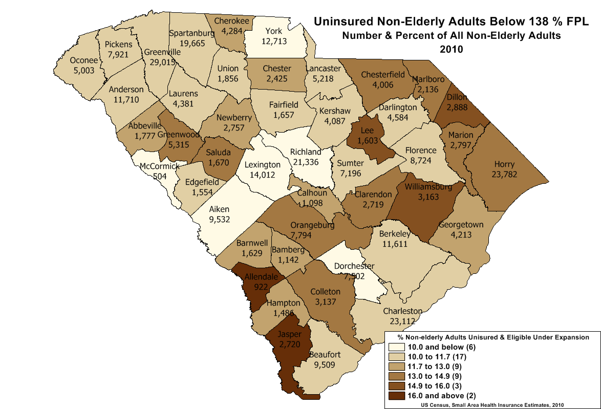
Figure 2
The map above shows the potentially eligible uninsured population as a proportion of the non-elderly adult population.
For more, go to The Ruoff Group.
Share this

Contact Us
Have questions? Send us a private message using the form below.